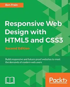
Ben Frain, "Responsive Web Design with HTML5 and CSS3 - Second Edition: Build responsive and future-proof websites to meet the demands of modern web users"
2017 | pages: 312 | ISBN: 1784398934 | EPUB | 12,2 mb
2017 | pages: 312 | ISBN: 1784398934 | EPUB | 12,2 mb
Learn the HTML5 and CSS3 you need to help you design responsive and future-proof websites that meet the demands of modern web users
About This Book
- Learn and explore how to harness the latest features of HTML5 in the context of responsive web design
- Learn to wield the new Flexbox layout mechanism, code responsive images, and understand how to implement SVGs in a responsive project
- Make your pages interactive by using CSS animations, transformations, and transitions
What You Will Learn
- Understand what responsive design is, and why it's vital for modern web development
- HTML5 markup is cleaner, faster, and more semantically rich than anything that has come before - learn how to use it and its latest features
- Integrate CSS3 media queries into your designs to use different styles for different media. You'll also learn about future media queries which are evolving in CSS4.
- Responsive images allow different images to be presented in different scenarios. We'll cover how to load different sets of images depending upon screen size or resolution and how to display different images in different contexts.
- Conquer forms! Add validation and useful interface elements like date pickers and range sliders with HTML5 markup alone.
- Implement SVGs into your responsive designs to provide resolution independent images, and learn how to adapt and animate them
- Learn how to use the latest features of CSS including custom fonts, nth-child selectors (and some CSS4 selectors), CSS custom properties (variables), and CSS calc
In Detail
Desktop-only websites just aren't good enough anymore. With mobile internet usage still rising, and tablets changing internet consumption habits, you need to know how to build websites that will just 'work', regardless of the devices used to access them. This second edition of Responsive Web Design with HTML5 and CSS3 explains all the key approaches necessary to create and maintain a modern responsive design.
The changing way in which we access the web means that there has never been a greater range of screen sizes and associated user experiences to consider. With these recent trends driving changes in design, typical desktop-only websites fail to meet even minimum expectations when it comes to style and usability, which can be vital when your website is central to yours or your client's brand. Responsive Web Design with HTML5 and CSS3, Second Edition is an updated and improved guide that responds to the latest challenges and trends in web design, giving you access to the most effective approaches to modern responsive design.
Learn how to build websites with a “responsive and mobile first” methodology, allowing a website to display effortlessly on every device that accesses it. Packed with examples, and a thorough explanation of modern techniques and syntax, Responsive Web Design with HTML5 and CSS3, Second Edition provides a comprehensive resource for all things 'responsive'.
This updated new edition covers all the most up-to-date techniques and tools needed to build great responsive designs, ensuring that your projects won't just be built 'right' for today, but in the future too.
Chapter example code is all hosted on rwd.education, a dedicated site for the book, built by the author, using the approaches and techniques championed throughout.
Table of Contents
- The Essentials of Responsive Web Design
- Media Queries - Supporting Differing Viewports
- Fluid Layouts and Responsive Images
- HTML5 for Responsive Web Designs
- CSS3 - Selectors, Typography, Color Modes, and New Features
- Stunning Aesthetics with CSS3
- Using SVGs for Resolution Independence
- Transitions, Transformations, and Animations
- Conquer Forms with HTML5 and CSS3
- Approaching a Responsive Web Design
My Link


