

Statistics graphs using Excel
Statistics graphs using Excel
.MP4 | Video: 1280x720, 30 fps(r) | Audio: AAC, 44100 Hz, 2ch | 284 MB
Duration: 34 mins | Genre: eLearning | Language: English
Way to display large amounts of data graphically
.MP4 | Video: 1280x720, 30 fps(r) | Audio: AAC, 44100 Hz, 2ch | 284 MB
Duration: 34 mins | Genre: eLearning | Language: English
Way to display large amounts of data graphically
What you'll learn
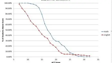
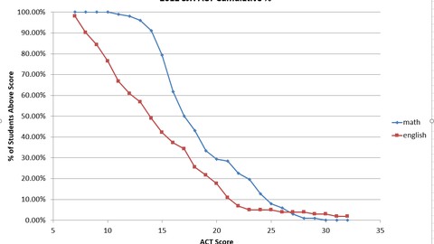
Create box plots, histograms, cumulative percentage graphs.
Requirements
excel software
Description
If you work with large amounts of data, you may want to present data graphically to get your message across quickly and effectively. You will be able to make box plots, histograms, correlation coefficients, pie charts. You can search for my standard deviation video if you want to add some statistical soundness to your presentation.
Who this course is for:
people who work with large amounts of data.
Statistics graphs using Excel

Bookmark My Blog & Visit it Daily for More Video Tutorial