Tags
Language
Tags
June 2025
Su Mo Tu We Th Fr Sa
1 2 3 4 5 6 7
8 9 10 11 12 13 14
15 16 17 18 19 20 21
22 23 24 25 26 27 28
29 30 1 2 3 4 5
    Attention❗ To save your time, in order to download anything on this site, you must be registered 👉 HERE. If you do not have a registration yet, it is better to do it right away. ✌

    https://sophisticatedspectra.com/article/drosia-serenity-a-modern-oasis-in-the-heart-of-larnaca.2521391.html

    DROSIA SERENITY
    A Premium Residential Project in the Heart of Drosia, Larnaca

    ONLY TWO FLATS REMAIN!

    Modern and impressive architectural design with high-quality finishes Spacious 2-bedroom apartments with two verandas and smart layouts Penthouse units with private rooftop gardens of up to 63 m² Private covered parking for each apartment Exceptionally quiet location just 5–8 minutes from the marina, Finikoudes Beach, Metropolis Mall, and city center Quick access to all major routes and the highway Boutique-style building with only 8 apartments High-spec technical features including A/C provisions, solar water heater, and photovoltaic system setup.
    Whether for living or investment, this is a rare opportunity in a strategic and desirable location.

    Tonos & Tonos Mono Font Family

    Posted By: GFX_MAN
    Tonos & Tonos Mono Font Family

    Tonos & Tonos Mono Font Family
    OTF | 7.63 MB

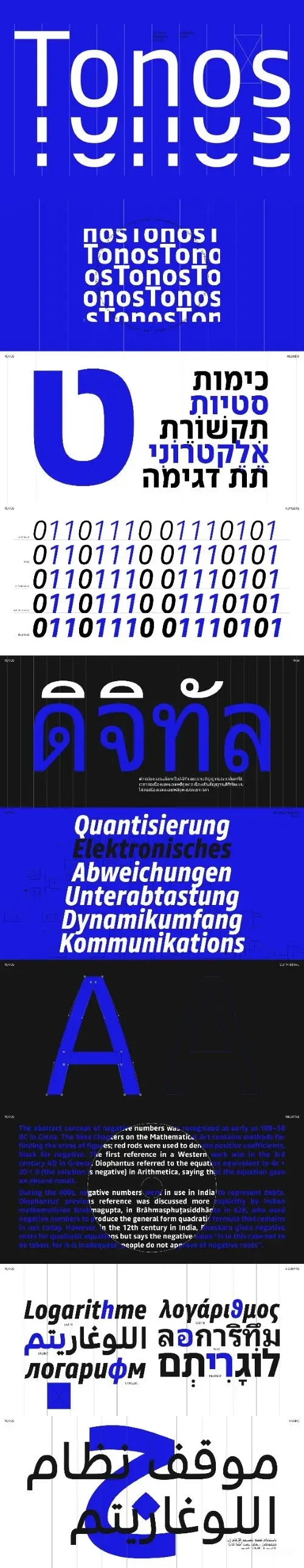
    Tonos is a sans-serif typeface designed specifically for use in UI and HMI contexts. It’s a truly functional font that’s capable of conveying a range of tones and voices across six writing systems, including Latin, Arabic, Thai, Cyrillic, Greek, and Hebrew.

    The name “Tonos” comes from the Greek language and means “accent”, a fitting name that reflects the typeface’s ability to convey tone and style across languages. Tonos has a Latin heritage in the glyph design that’s inspired by calligraphy, giving the typeface a “humanistic” quality that makes it feel warm and inviting. This principle has been carried over into all six writing systems, each of which is allowed to express its own visual language while still maintaining a harmonious overall design. The result is a font that’s highly legible and sturdy, yet still manages to be visually engaging and pleasant to read.