November 2025
| Su | Mo | Tu | We | Th | Fr | Sa |
|---|---|---|---|---|---|---|
| 26 | 27 | 28 | 29 | 30 | 31 | 1 |
| 2 | 3 | 4 | 5 | 6 | 7 | 8 |
| 9 | 10 | 11 | 12 | 13 | 14 | 15 |
| 16 | 17 | 18 | 19 | 20 | 21 | 22 |
| 23 | 24 | 25 | 26 | 27 | 28 | 29 |
| 30 | 1 | 2 | 3 | 4 | 5 | 6 |
Attention❗ To save your time, in order to download anything on this site, you must be registered 👉 HERE. If you do not have a registration yet, it is better to do it right away. ✌

SpicyMags.xyz

SpicyMags.xyz
Vida Pro Font Family
Date: 5 Apr 2014 15:21:36
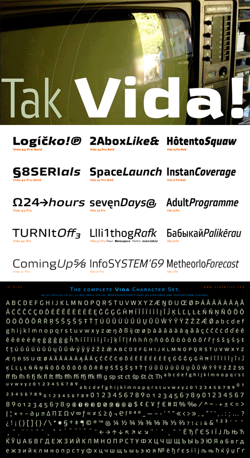
New typeface family Vida has been designed in summer 2006. The drawing of each letter form differs finely in its logic, which is a feature invisible at first. It is constructed on a puristic base, but it doesn‘t reject the natural anomalies already known from ages of experience with latin alphabet. That‘s why e. g. upper left section of “n” is constructed differently from that of „r, similarly as “d” doesn’t repeat right-bottom ending after “u”, “9” is not inverted “6“. Such details improve reading in continuous text. The behavior is consistent on all output devices due to monolinear design; the lightest weight doesn’t fade, the darkest isn’t blurred, all is legible and clear in smallest sizes. Stem connections and endings were adjusted to avoid undesirable optical darkening. The goal we desired was to achieve balance appearance in both electronic and printed form.


