

Microsoft Power BI - Custom Visualizations

Microsoft Power BI - Custom Visualizations
Duration: 41m | .MP4 1280x720, 30 fps(r) | AAC, 48000 Hz, 2ch | 274 MB
Genre: eLearning | Language: English
Duration: 41m | .MP4 1280x720, 30 fps(r) | AAC, 48000 Hz, 2ch | 274 MB
Genre: eLearning | Language: English
In this class, you'll learn to create visuals that go beyond the default Power BI settings. Have you felt frustrated that there are charts you can easily create in Excel, but not in Power BI? Fear not, there are many work arounds!
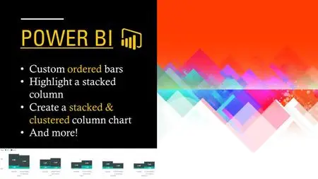
Specifically, this class will cover:
Customizing the order of bars or content in a chart
Highlighting specific bars or sections of a stacked column chart
Adding a total line to a line chart
A way to simulate a combination of stacked and clustered column chart
For most cases, we'll cover both the quick and dirty method, and the comprehensive and sustainable method. There's a time and a place for both.
If you're looking to find a solution for a specific problem, click through the lessons to find your relevant video. If you just want to up your PBI skills, watch from the beginning and try it on your own desktop.
This may also serve as a good introduction to using DAX and Power Query Editor, although it may require a few watches if you have never used them before.
More Info