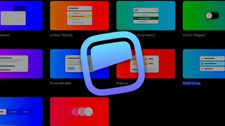
Complete Headless Ui With Next.Js And Tailwindcss
Published 11/2022
MP4 | Video: h264, 1280x720 | Audio: AAC, 44.1 KHz
Language: English | Size: 1.64 GB | Duration: 2h 59m
Published 11/2022
MP4 | Video: h264, 1280x720 | Audio: AAC, 44.1 KHz
Language: English | Size: 1.64 GB | Duration: 2h 59m
Create Menu (Dropdown), Listbox (Select), Combobox (Autocomplete), Switch (Toggle), Disclosure, Dialog (Modal), Popover
What you'll learn
Create Menu (Dropdown) component
Create Listbox (Select) component
Create Combobox (Autocomplete) component
Create Switch (Toggle) component
Create Disclosure component
Create Dialog (Modal) component
Requirements
basic reactjs
basic tailwindCSS
Description
What we are going to learn?We will walk through all the components in Headless UI, including Menu (Dropdown), Listbox (Select), Combobox (Autocomplete), Switch (Toggle), Disclosure, Dialog (Modal), Popover, Radio Group, Tabs and Transition.Why Headless UI?Headless UI, a component library for React.js or Vue.js called Headless UI was developed by the same team who made Tailwind CSS. Our developers like not having to alter or get past the pre-installed default styles of other component libraries. Developers may concentrate more productively on the user experience and business challenge because to the components' deep functionality, complete accessibility, and frictionless aesthetics. Unsurprisingly, Tailwind CSS classes work well with Headless UI.Why Nextjs?All of the React components that make up a website's user-facing section are rendered on the server first. This means that after the HTML has been transmitted to the client (the user's browser), the user can read the material on the page without having to do anything further. The user perceives page loading speeds to be substantially faster as a result of this.SSR also provides an out-of-the-box, indexable and crawlable website, which is critical for Search Engine Optimization (SEO) because no client-side javascript is required to view the page content. Essentially, increased technical SEO benefits our clients.Why tailwindCSS?Tailwind CSS is a popular low-level CSS framework with a lot of customization options. Bootstrap is widely used as a comparison. They are, nevertheless, essentially different. Rather of delivering pre-designed components like Bootstrap, Tailwind provides building pieces that allow developers to quickly create designs.
Overview
Section 1: Headless UI Transition
Lecture 1 Headless UI Transition basic example
Lecture 2 Headless UI Transition using as prop
Lecture 3 Headless UI Transition multiple transition
Section 2: Headless UI Dialogue
Lecture 4 Headless UI Dialogue create dialogue
Lecture 5 Headless UI Dialogue manage focus
Lecture 6 Headless UI Dialogue styling
Lecture 7 Headless UI Dialogue transition
Section 3: Headless UI Combobox (Autocomplete)
Lecture 8 Headless UI Combobox using object data
Lecture 9 Headless UI Combobox add checkbox
Lecture 10 Headless UI Combobox multiple values
Lecture 11 Headless UI Combobox active current user
Lecture 12 Headless UI Combobox empty values
Lecture 13 Headless UI Combobox transition
Lecture 14 Headless UI Combobox add selector icon
Section 4: Headless UI Listbox
Lecture 15 Headless UI Listbox basic example
Lecture 16 Headless UI Listbox active style and react heroicon
Lecture 17 Headless UI Listbox horizontal and vertical
Lecture 18 Headless UI Listbox add transition
Section 5: Headless UI Dropdown Menu
Lecture 19 Headless UI Menu (Dropdown) create project
Lecture 20 Headless UI Menu (Dropdown) add style to the menu
Lecture 21 Headless UI Menu (Dropdown) Add transition
Lecture 22 Headless UI Menu (Dropdown) Multiple values
Lecture 23 Headless UI Menu (Dropdown) custom button to toggle show and hide
Lecture 24 Headless UI Menu (Dropdown) using React layout
Lecture 25 Headless UI Menu (Dropdown) mylink
Section 6: Headless UI Disclosure
Lecture 26 Headless UI Disclosure basic example
Lecture 27 Headless UI Disclosure
Lecture 28 Headless UI Disclosure
Section 7: Headless UI Popover
Lecture 29 Headless UI Popover Basic Example
Lecture 30 Headless UI Popover styling different states
Lecture 31 Headless UI Popover custom button
Lecture 32 Headless UI Popover overlay
Lecture 33 Headless UI Popover transition
Lecture 34 Headless UI Popover grouping
Section 8: Headless UI Radio Group
Lecture 35 Headless UI Radio Group basic example
Lecture 36 Headless UI Radio Group add checkbox
Lecture 37 Headless UI Radio Group
Section 9: Headless UI Tabs
Lecture 38 Headless UI Tabs basic example
Lecture 39 Headless UI Tabs styling the selected tab
Lecture 40 Headless UI Tabs disable and manually activate
Lecture 41 Headless UI Tabs vertical arrangement and default selection
Developers who want to create components easily with Headless UI


