

Editor X Masterclass - Build Amazing Websites | No Coding

Editor X Masterclass - Build Amazing Websites | No Coding
Duration: 8h 29m | .MP4 1280x720, 30 fps(r) | AAC, 44100 Hz, 2ch | 5.1 GB
Genre: eLearning | Language: English
Duration: 8h 29m | .MP4 1280x720, 30 fps(r) | AAC, 44100 Hz, 2ch | 5.1 GB
Genre: eLearning | Language: English
For those of you who are not familiar with Editor X, Editor X is basically a web application or an advanced creation platform for designers and web professionals. Editor X combines cutting edge responsive design with relatively easy and smooth drag and drop experience. With Editor X you can design and build almost any website you imagine. It's possible to design and build beautiful websites without any experience with Web development whatsoever!
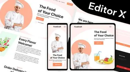
Editor X allows you to build fully responsive websites that automatically scale to any screen size or device they are being viewed on to deliver the best user experience. Using the latest design technology like flexible grids, layouts, fluid sizing and breakpoint customization, you can ensure that your site looks exactly how you want on various different screen sizes.
Also Editor X has quite clean and intuitive interface which will allow us to easily navigate between many different tools, features, categories, panels and that way keep our focus primarily on building our website.
Now we are going to start this course by completely introducing with almost every Editor X tool and feature. You'll get familiar with it's design interface, canvas, shortcuts, compositions and all other components which are essential for one website to be responsive and good looking.
You'll see in action how Flexbox technology can help us apply responsiveness to our website. Flexbox is a CSS container created around elements to ensure they're automatically arranged depending on screen size. It's a helpful tool in responsive design that prevents things from getting messy, like when elements overlap or change their order. The most useful Flexbox technology tools are Layouters and Repeaters. They will automatically adjust your content to every screen size without even thinking about breakpoints.
After that I will introduce you to the Content Manager. And it's main purpose is to act as a database on the backend. With content manager we can create something that's called a collection, and a collection is basically a data table which can contain different types of information in the form of rows and columns. There we can put images, links, text video, audio, document and many other different types of data.
We can use Content manager to display that data to our website or ever gather some information from our visitors through the forms, where users can write some information and send them directly to our backend inside a collection.
You will learn how to apply beautiful and smooth animations and hover interactions to a website as well. Also we are going to explore an app market where we can search and find many different useful applications which are available on Editor X platform. Those applications can be installed on our website in just a click within a few seconds. And Like I said there you can find many different apps but some of the most popular ones are for building a blog, forum or even an online store on your website. In this course I have explained everything you need to know about it.
And there's more! At the end of this course, when we cover everything you need to know about building websites with Editor X, we are going to start working on a real project, where we are going to design and build our own website from scratch!
So what are you waiting for, let's get started!
More Info