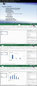
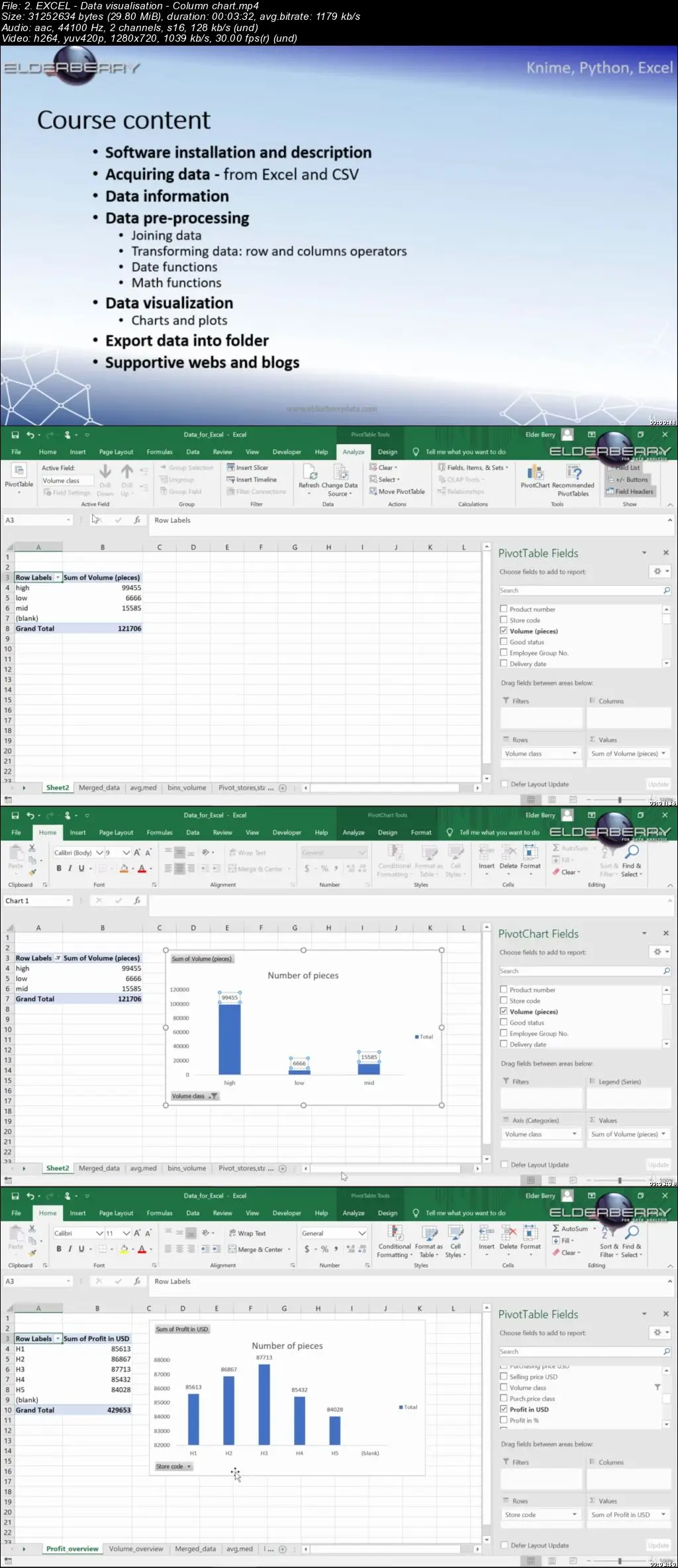
From Excel to Python | Knime: preprocess and visualize data
Video: .mp4 (1280x720, 30 fps(r)) | Audio: aac, 44100 Hz, 2ch | Size: 2.64 GB
Genre: eLearning Video | Duration: 68 lectures (5 hour, 6 mins) | Language: English
Video: .mp4 (1280x720, 30 fps(r)) | Audio: aac, 44100 Hz, 2ch | Size: 2.64 GB
Genre: eLearning Video | Duration: 68 lectures (5 hour, 6 mins) | Language: English
Learn to pre-process and visualize data frames by using popular analytical software: Python & Knime & Excel
What you'll learn
Work with data frames (data wrangling | manipulation | visualisation) to prepare and understand your data
Work with Knime analytics platform environmnet
Undestand the Python's syntaxes and how to work in Jupyter Notebook environment
Use Pandas, Matplotlib, Seaborn API's enabling to transform data frames and create charts and plots in Python
Model and transform data
Visualise the data in charts and plots
Read data and work with more and different file types at one place
Join and merge different data
Group and pivot data by selected parameters
Modify, filter, resort, split, filter data, handle with missing values
Use basic math formulas on the columns
Use feature scaling to normalize your data under one common range
Visualise data by using different plots and charts (box plot, pie chart, scatter plot, line plot, histogram/column chart)
Transpose tables
Understand the Knime, Python and Excel environment
Requirements
access to computer or laptop with Windows (32bit or 64 bit), Linux (64bit) or Mac (64bit) and with permission to download softwares (if not, ask your administrator to download it for you – it is common at company´s computers)
no prior skills required (basic data analyzing experience in different programs is an advantage)
Description
We will focus on the most time-consuming part of the machine learning process which is the data exploration consisting from data visualisation and data wrangling serving for preparing and understanding your data.
The whole course is full of different data manipulation and visualisation hands-on exercises in three popular data science platforms:
1. open-source and very progressive programming language Python
2. open-source, highly intuitive and effective analytics platform KNIME
3. the most popular for people working with data MS Excel,
where we we will load data, transform them and visualise them.
So, what will we cover during this course?
Start with the KNIME analytics platform (installation and environment description)
Start with Python (installation and environment description)
Gathering the data into all platforms (data from Excel and csv)
Data manipulation (preparation and transformation) I - Table, Row transform, Row filter and split
Data manipulation (preparation and transformation) II - Column Binning, Column Convert and replace, Column Filter, Column Split, Column Transform,
Data manipulation (preparation and transformation) III - Other data types – date and time.
Data manipulation - Feature scaling
Data visualisation - Histogram, Line plot, Pie chart, Scatter plot, Box plot
Who this course is for:
data analysts, data scientists and those of you willing to learn new things
anyone searching open-source, user-friendly, easily understandable and highly effective SW for data analyzing and machine learning tasks
people working with data (also with big data)


