
Excel Data Visualization: Mastering 20+ Charts and Graphs
Excel Data Visualization: Mastering 20+ Charts and Graphs
.MP4, AVC, 1280x720, 30 fps | English, AAC, 2 Ch | 2h 23m | 488 MB
Instructor: Chris Dutton
.MP4, AVC, 1280x720, 30 fps | English, AAC, 2 Ch | 2h 23m | 488 MB
Instructor: Chris Dutton
When you think data visualization, you might not think Microsoft Excel. But Excel offers a large number of charts and graphing tools that complement its data analysis toolset. This course offers a laser-focused, practical guide to over 20 useful Excel charts and graphs for data visualization. Instructor Chris Dutton reviews the key principles of data visualization, and provides some introductory tips to help you customize any kind of chart in Excel.
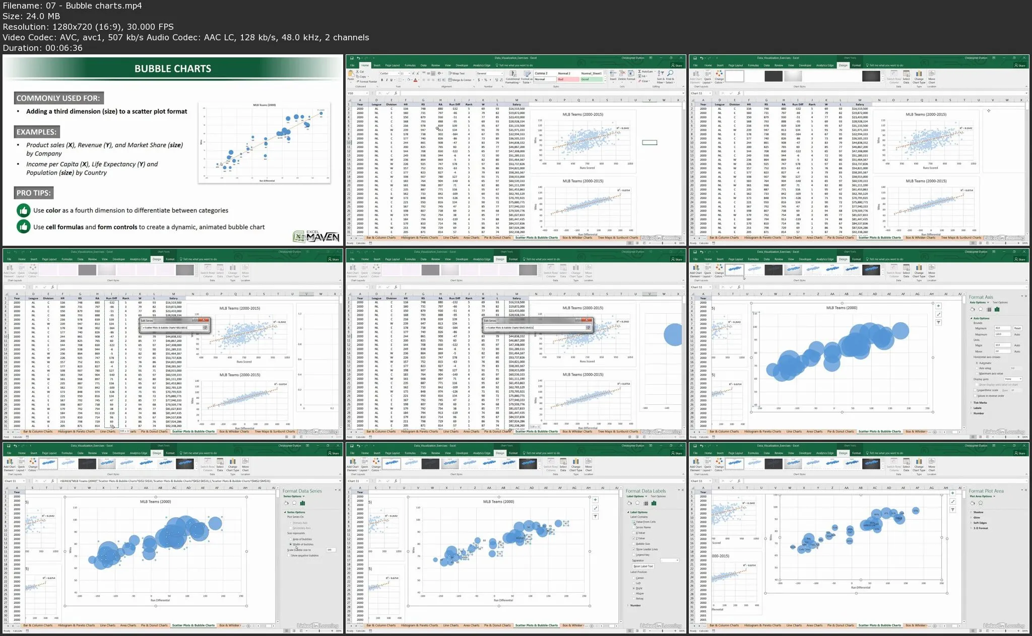
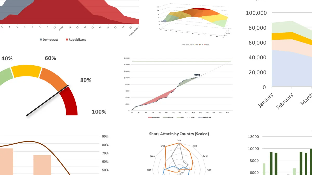
In this section, you can learn how to adjust text and cell formatting, change the chart type and axes, and leverage built-in templates. In chapter three, Chris reviews the different chart types: from basic bar and pie charts, to scatter plots, histograms, funnel charts, and sparklines. Plus, learn how to create geospatial heat maps and 3D power maps, and combine different chart types on one sheet.
Learning objectives
- Recognize the importance of the ten-second rule when creating visuals in Excel.
- Identify the relationship between data and the visualizations you create in Excel.
- Name the manner in which you can provide the deepest dive into data as you apply visualizations in Excel.
- Explain how a particular Excel chart type will relate different scales to return the output you want.
- Explore the differences in the effectiveness of Excel chart types in relaying information.
- List the justifications for using one type of Excel chart over another.
Excel Data Visualization: Mastering 20+ Charts and Graphs