Microsoft Power BI Masterclass™ - A Complete Hands-on Guide
Video: .mp4 (1280x720, 30 fps(r)) | Audio: aac, 44100 Hz, 2ch | Size: 3.15 GB
Genre: eLearning Video | Duration: 06:20:45 | Language: English
Video: .mp4 (1280x720, 30 fps(r)) | Audio: aac, 44100 Hz, 2ch | Size: 3.15 GB
Genre: eLearning Video | Duration: 06:20:45 | Language: English
Learn how to use Microsoft's Power BI Tools, Power BI desktop, Power BI Services, Data Visualization & Advanced Tools.
What you'll learn
Download latest Power BI Desktop and connect to Power BI online
Data visualization types Charts, Bars, Pie, Gauge etc.
Format visuals color size and labels
Filter and drill downs
Creating impactful reports
Publish reports to Power BI online
Create alerts and subscriptions in Power BI online
Requirements
Basic understanding of excel could be helpful but not mandatory
Description
Data visualization is the standard way to communicate complex information into meaningful visuals that have a long-lasting impact. Gone are the days when data analysis was restricted to a spreadsheet and limited graphing capabilities. The current era of business intelligence has equipped business professionals with state-of-the-art analytical tools such as Power BI allowing them to visually see the state of the business and identify patterns to bolster successful strategies.
Microsoft Power BI (business intelligence) is a powerful visualization and analytics tool that helps companies of all sizes analyze their data and share insights. With this technology, enterprises can monitor their business more closely and get instant answers with rich dashboards available for every device.
The course Power BI for business professionals is designed for anyone who wants to create impactful visualizations and reports that utilize the underlying data and convey the message that has a long-lasting impact. The course is organized in small bitesize lectures in order to retain the attention of the student. The course begins by covering the core concepts of Power BI and data visualization. It then covers the specific visualization and their purposes. Many sections in the course contain practical activity files to help students test and apply their knowledge in a real scenario.
Course Outline (Detailed)
Introduction
In this video instructors are introduced as well as how the course is organized is explained
2.1
Introduction to Power BI
In this video the instructor will narrate the Lesson 2 outline
Lesson 2: Signing Up for Power BI and Loading Data
2.2
Downloading Power BI Desktop
In this video the instructor will narrate the basic steps and system requirements to download Power BI
2.3
Login into Power BI online
In this video the instructor will outline the procedure to Login into Power BI
2.4
Loading Data into Power BI
In this video the instructor will give a demo on how to load data in Power BI
2.5
Recap & Conclusion
In this video the instructor will recap and conclude Lesson 2
Lesson 3: Power BI Tables
3.1
Introduction to Power BI Tables
In this video the guide will narrate the Lesson 3 outline
3.2
Creating your first table in Power BI
In this video the narrator will exhibit the course of actions taken to create a table in Power BI
3.3
Formatting and sorting Tables
In this video the instructor will narrate the ways to format and sort tables in Power BI
3.4
Using Multiple Measures in Tables
In this video the narrator will demonstrate the process to insert multiple measures in a single table
3.5
Cross Filtering Tables
In this video the guide will instruct on how to cross filter tables in Power BI
3.6
Practical Activity - Tables
Practical Activity testing understanding of tables
3.7
Methods of Aggregation
In this video the instructor will exhibit the techniques to compile information from databases in Power BI
3.8
Practical Activity - Methods of Aggregation
Practical Activity testing how information can be aggregated and presented in Power BI
3.9
Percentage Calculations
In this video the narrator will illustrate the ways to calculate percentages of data in Power BI
3.10
Conclusion to Tables Section
In this video the guide will recap and conclude Lesson 3
Lesson 4:Matrix and Cards
4.1
Introduction to Matrix and Cards
In this video the instructor will narrate the Lesson 4 outline
4.2
Creating the Matrix Visualization
In this video students will learn how matrix tables can be visualized on Power BI canvas
4.3
Methods of Aggregation for Matrix
Students will learn how information could be added to give an sum view of the data presented on a matrix table
4.4
Percentage of Calculations for the Matrix
Students will learn how numbers presented on a matrix table can be converted to percentages
4.5
Multi Row Visualization
KPI cards are good way to present numbers. In this video student will learn how to use KPIs to create multi row visualizations
4.6
Card Visualization
Card visualization covered in this video will demonstrate how to present and label a single KPI on the Power BI canvas
4.7
Practical Activity - Cards, Multi Row and Matrix
Practical activity testing knowledge of Cards, Multi Row and Matrix
4.8
Conclusion to Matrix and Card Visualizations
Topic is summarized in this video
Lesson 5: Filters and Slicers
5.1
Introduction to Filters and Slicers
The video introduces the important concept of filters and slices which when applied can create visualizations which are more specific to user needs
5.2
Text Slicers
This video demonstrates how slicers could be applied to text to filter information
5.3
Numeric Slicers
This video demonstrates how slicers could be applied to numbers to filter information
5.4
Date Slicers
This video covers how a date can be filtered by using date slicers
5.5
Visual Level Text Filters
This video demonstrates how visuals could show customized information by applying visual level text filters
5.6
Visual Level Numeric Filter
The video is an extension to visual level filters demonstrating how numeric filters can be applied to a visual
5.7
Visual Level Date Filters
The video is an extension to visual level filters demonstrating how date
filters can be applied to a visual
5.8
Page and Report Level Filters
The video is an extension to visual level filters demonstrating how date
filters can be applied to a visual
5.9
Practical Activity - Filters
Practical activity testing knowledge of filters
5.10
Conclusion to Filters and Slicers
Chapter round up of lesson 5
Lesson 6:Column Visualizations
6.1
Introduction to Column Visualizations
Column visualization are introduced and expectations of videos coming in lesson is set
6.2
Column Visualizations
How to make a basic column visualization is covered
6.3
Stacked Column Visualizations
Stacked column visualization is covered. Students learn what is the difference between the 2 types of column visualization and when to use them
6.4
Cross Filtering and Slicers
How to set cross filters to slicers to add more interactivity to visualizations
6.5
Practical Activity - Column and Bar Visualizations
Practical Activity testing knowledge of Column and Bar Visualizations
6.6
Graph Options
Different types of graph visualizations available in Power BI
6.7
Analytics Pane
How the analytics pane can add dynamic reference lines to visuals, and provide focus for important trends or insights
6.8
Practical Activity - Graph Options
Practical Activity testing understanding of Graph Options in Power BI
6.9
Conclusion to the Column Visualizations Section
Lesson round-up video summarizing what is taught
Lesson 7:Trend Analysis
7.1
Introduction to Trend Analysis
How trend analysis can enrich the current visualization in power bi
7.2
Line Graphs
Learn how to add line graphs in power BI
7.3
Area Graphs
How lines can be converted to area charts
7.4
Ribbon Graphs
How to make ribbon graphs in power bi
7.5
Practical Activity - Trend Analysis
Practical Activity testing understanding of Trend analysis in Power BI
7.6
Conclusion to Trend Analysis Section
Lesson round up video summarizing what is taught
Lesson 8 :Other Graph Types
8.1
Introduction to Other Graph Types
Introduction to other types of charts used in Power BI
8.2
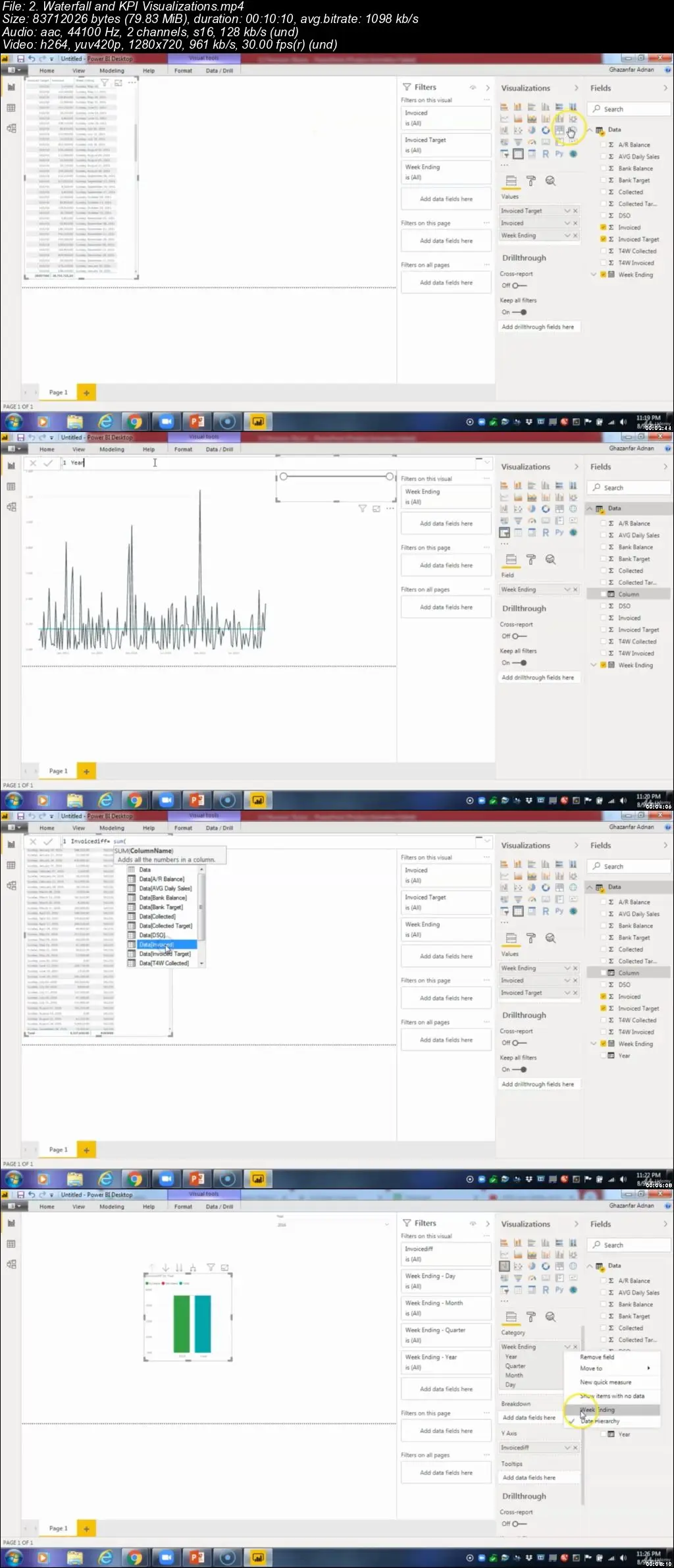
Waterfall and KPI Visualizations
How waterfall and KPI charts could help us create a visualization
8.3
Combination Graphs
In this video combination charts are explained in Power BI. How they can be helpful in conveying greater detail in the same visualization
8.4
Pie Graphs
How pie charts are made in power bi are explained in this video
8.5
Tree map Graphs
How tree map visualization is created in power bi is explained in this video
8.6
Geographical Graphs
How information such as name of cities and countries can help present companies’ information on a map
8.7
Scatterplots and Bubble plots
Other charts such as Scatterplots and Bubble plots are explained in this video
8.8
Practical Activity - Scatterplots
Practical Activity – Scatterplots test students understanding from previous videos
8.9
Practical Activity Scatterplots Tutorial
This video contains answers to the practical activity conducted
8.10
Conclusion to Other Graphs
Chapter Roundup summarizing the concepts learned in previous videos
Lesson 9: Interactive Dashboards
9.1
Introduction to Interactive Reports/Dashboards
In this lesson we cover the objectives of how the previously acquired knowledge could be used to create interactive reports in power bi
9.2
DIY Worldwide LLC
A scenario of a fictitious company Worldwide LLC where information could be used to create a report
9.3
Drill Through Filters
In this video concept of how a visual can provide a more focused information using drill though filters
9.4
Advanced ToolTips
Advance tool tips help to create a custom information to be shown as a tool tip of a visualization
9.5
Bookmarks
How information or a visual could be bookmarked to create a story line effect in Power BI
9.6
Publishing reports
How reports in desktop could be published to power BI online
9.7
Conclusion to Interactive Dashboards
Chapter roundup summarizing the core concepts learned
Lesson 10 : Power BI Service
10.1
Introduction to Power BI Service
Power BI online service is introduced in this lesson
10.2
Setting Up Dashboards
How different visuals from multiple reports could be combined in the form a dashboard in power bi
10.3
Dashboards V Reports
Major differences between dashboard and report is identified
10.4
Set up Alerts and Subscriptions
How can we setup alerts for a visuals or subscriptions for updates on data models is created in Power BI
10.5
Getting Insight from your Data
How the analytics engine of power BI can generate insights in Power BI online
10.6
Setting up the Mobile View
The video aims to discuss how reports and dashboards are best optimized for mobile views
10.7
Natural Language Queries
The NLP is a brand-new feature of Power BI which helps us ask questions from the data source by typing English sentences.
10.8
Practical Activity - Natural Language
Practical Activity - Natural Language testing understanding of
10.9
Conclusion to the Power BI Service
Conclusion video summarizing what is covered in previous videos of the lesson
Lesson 11:Power BI Security, Workspaces and Refresh
11.1
Introduction to Power BI Security, Workspaces and Refresh
In this video the security features and data refresh options of power bi are introduced
11.2
Data Gateways
In this video the instructor explained how data gateway can help sync data that is lying on local machine to power BI online
11.3
Row Level Security
How information could be kept secure by restricting access applied on certain rows of data in Power BI
11.4
Creating workspaces in Power BI
How workspaces are created in Power BI online to share and collaborate with others
11.5
Publishing Apps
How publishing apps can help broadcast our reports and dashboard and share with entire organization.
11.6
Conclusion to Power BI Security, Workspaces and Refresh
Conclusion video summarizing what is covered in previous videos of the lesson
Lesson 12:Power BI and Excel
12.1
Introduction to Power BI and Excel
Lesson introductory video highlighting how power BI reports could be further analyzed in excel
12.2
Power BI and Excel Pivot Tables
How Power BI reports could be exported and analyzed in excel pivot tables
12.3
Pinning Excel Ranges
How reports analyzed in excel could be pinned to Power BI
12.4
Excel Online Workbooks
How source file could be analyzed in online excel
12.5
Conclusion to Power BI and Excel
Conclusion video summarizing what is covered in previous videos of the lesson
Lesson 13:Custom Visualizations
13.1
Introduction to Custom Visualizations
How visuals can be made more customized are introduces in this video
13.2
Custom Visualizations
Different types of customization option available in Power BI are discussed in this video
13.3
Themes
How different themes could be added to a report in Power BI
13.4
Conclusion to Custom Visualizations
Conclusion video summarizing what is covered in previous videos of the lesson
Lesson 14:Publish and Embed Dashboards
14.1
Introduction to Publish and Embed
How reports could be published or embedded to other platforms such as power point
14.2
Publish and Embed Dashboards
How dashboards could be published or embedded to other platforms such as power point
14.3
Power BI Usage Reports
How activity of work done in Power BI could be monitored such as how many times a report is viewed.
14.4
Conclusion to Publish and Embed Dashboards
Conclusion video summarizing what is covered in previous videos of the lesson
Lesson 15: Course Conclusion
15.1
Course Conclusion
In this video a brief summary of each Lesson is given to give a small recap to students.
Who this course is for:
Students having some basic knowledge of Power BI skills and want to get better or want to be an expert in it.
Learners who want to learn Power BI from scracth and who want to understand how to use these tools.
Data professionals aspiring to master the number 1 business intelligence tool on the market.
All levels of users who are familiar with Power BI and want to learn how to publish, share & collaborate in the cloud.
Anyone looking for a hands-on & real-file project-based introduction to Microsoft Power BI.


