Building Data Visualizations Using Plotly

Building Data Visualizations Using Plotly
.MP4, AVC, 200 kbps, 1280x720 | English, AAC, 96 kbps, 2 Ch | 2h 11m | 245 MB
Instructor: Janani Ravi
.MP4, AVC, 200 kbps, 1280x720 | English, AAC, 96 kbps, 2 Ch | 2h 11m | 245 MB
Instructor: Janani Ravi
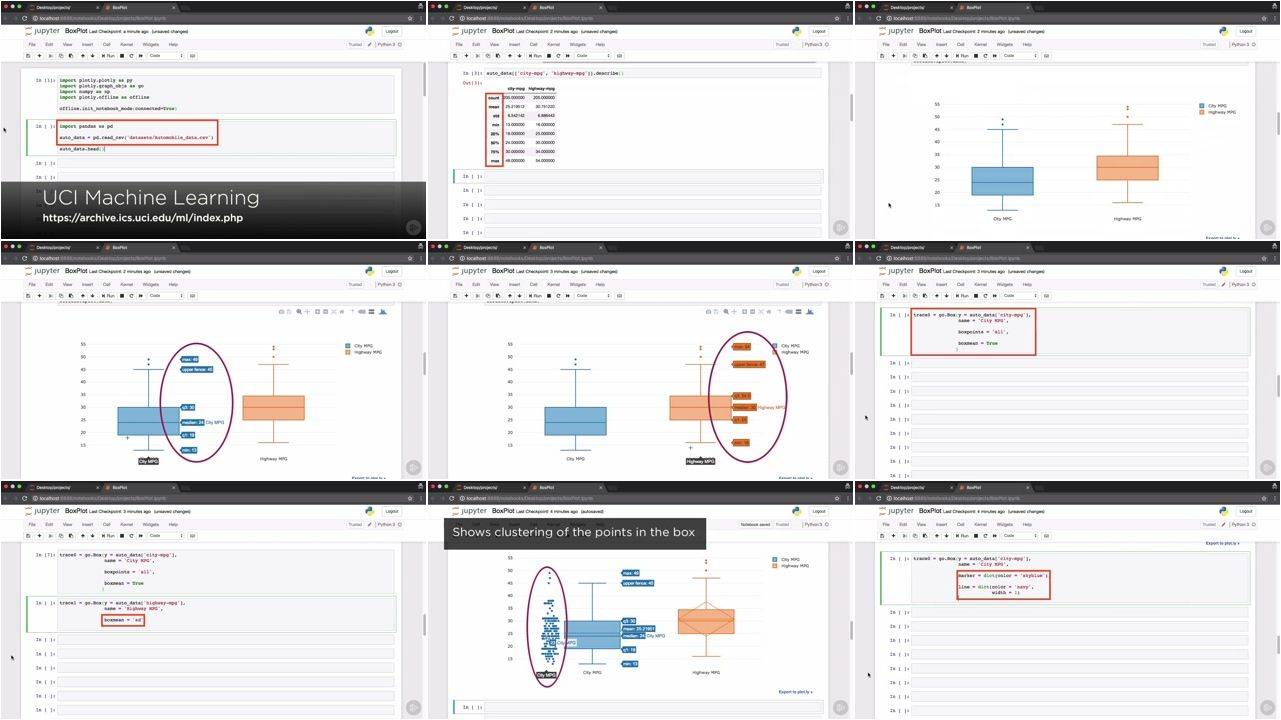
As datasets get larger, it becomes more important to explore and visualize this data effectively before plunging into data analysis. Visualization libraries, such as Plotly, can help us process and retain all of this information in the best way.
Data needs to be parsed and intuitively understood before you can use it for modeling and extracting insights. In this course, Building Data Visualizations Using Plotly, you will learn how to use the Plotly Python API to build a wide range of basic, intermediate, and advanced visualizations and animations. You will start off by working with Plotly in the offline as well as the online mode. You will learn to share visualizations using the Plotly Cloud and how to generate these visuals embedded within a Jupyter notebook. Next, you will see how to build basic graphs such as line and bar charts, histograms, pie charts, scatter, and box plots. Finally, you will move on to more advanced visualizations - such as Gantt charts commonly used for project management, Sankey diagrams to monitor network flow, 3D visualizations, and animations. At the end of the course, you will be comfortable using the Plotly Python API to build complex and vivid visualizations using data from the real world.
Building Data Visualizations Using Plotly